Design once, ship every brand
A white-label UI module system for mobile sports streaming — one set of components robust enough to become the NBA, the Premier League, or the ATP Tour without touching a single layout.
One platform. Indefinite brands. Zero redesigns.
Every sports brand that joins a streaming platform usually triggers the same expensive ritual: redesign the app, restyle every screen, rebuild the components. Multiply that by every league, federation and tour the platform wants to sign — and design becomes the bottleneck to growth.
The white-label answer flips the economics. As Lead Designer, I owned the creation of a module system where every component is designed exactly once — then rebranded indefinitely. The design department restyles wireframes instead of redrawing them; the front-end team builds one generic component per module, synced directly to backend data streams. A new brand becomes a theming exercise, not a project.
The goal: a scalable UI module system robust enough to be rebranded seamlessly across an indefinite number of sports brands — without sacrificing how good any single brand looks.
What makes white label hard
Every edge case, every sportScore, match state, player vs team, font selection — each module must absorb whatever any sport throws at it.
Every rebrand stylisationColours, logos, corner radii, elevation, typography — all swappable without breaking a layout.
Beautiful by defaultEach module has to be visually compelling without sacrificing a single one of those scalable options.
Built once, synced liveGeneric front-end components hook into backend data streams — the design has to map cleanly to the data.
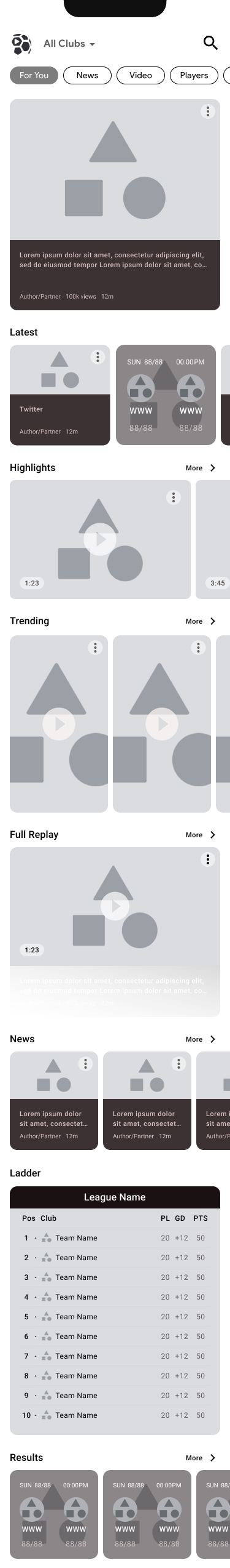
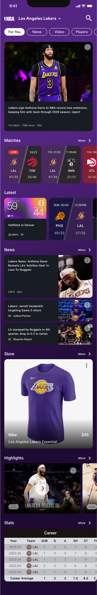
Ten modules, every sport, any brand
Each module ships in two states: the white-label base — placeholder anatomy with its content structure locked — and the rebrand, where colour, type, imagery and team data pour in. Base on the left, rebranded examples on the right.
4:4 Hero Card
Player Cards
Same anatomy at three densities — a hero player spotlight down to a compact stat row.
Stats
Beyond the generic compare module, bespoke cards — Match Pulse, Heatmap, Playing Style, Rivalries — show how far a brand can push within the system.
E-Commerce
The monetisation module — every brand's storefront, straight into the content feed.
Score Pills
One pill handles every match state — live, scheduled and fulltime — across team and head-to-head sports.
Ladder / Standings
The table flexes to each competition's format — PL/GD/PTS for football, W/L/PCT for basketball.
News Card
16:9 Video
Social Video (9:16)
Vertical clips meet Gen Z where they already scroll — the platform's bridge to social-native content.
Video Highlights
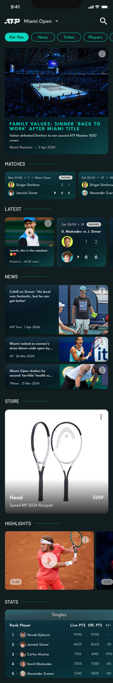
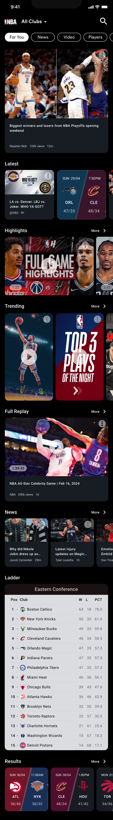
The proof: one app, four brands
The final screens, designed in Figma to Material 3 and compatible with iOS and Android. Some modules use a frosted-glass treatment so the brand colour bleeds through, creating depth without costing any customisation.
- Top pill navigation won in testing — fans preferred it because it carries many sub-navigation options without burying content.
- Frosted-glass module surfaces let each brand's background colour shine through the same component.
- Every phone below is the same module stack — only the theme changes.
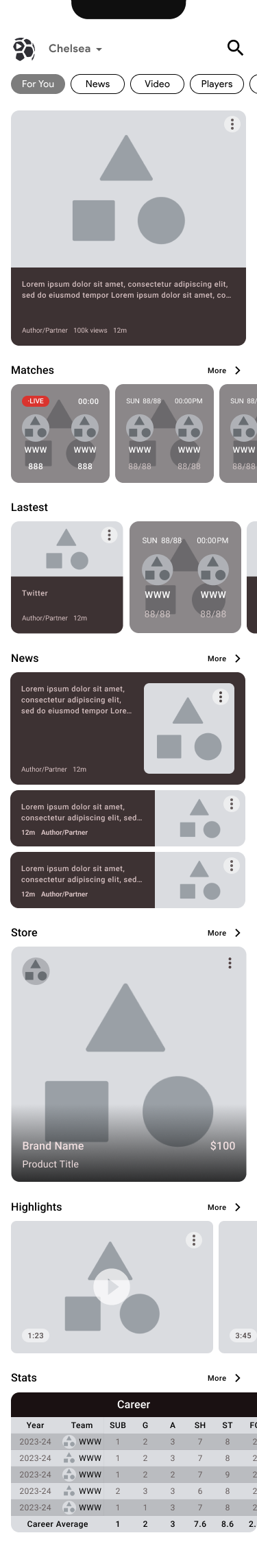
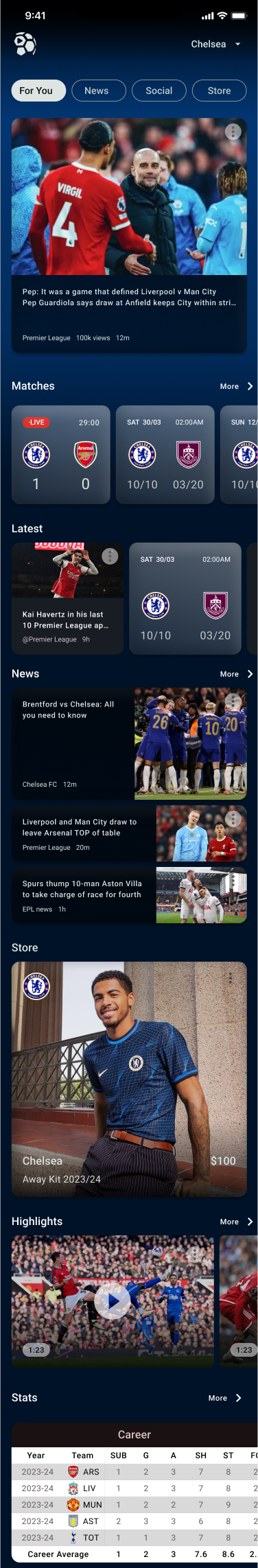
League-wide theming
The system scales beyond clubs to whole-league apps — same modules, league-level branding:
Function first — by design
"In a white-label system, function beats form — every module must declare its purpose instantly, under any brand."
— The principle that held the system togetherA module that only looks right in one theme is a broken module. Designing for an indefinite number of brands forces a discipline: anatomy first, stylisation second — and the system rewards it with every rebrand that ships in days, not months.
What's next: the honest trade-off of white labelling is sameness. Repeating identical modules across every brand eventually feels formulaic — so the next iteration introduces more bespoke, brand-specific modules (like the bespoke stats cards) layered on top of the shared system. The base pays the bills; the bespoke layer creates the delight.